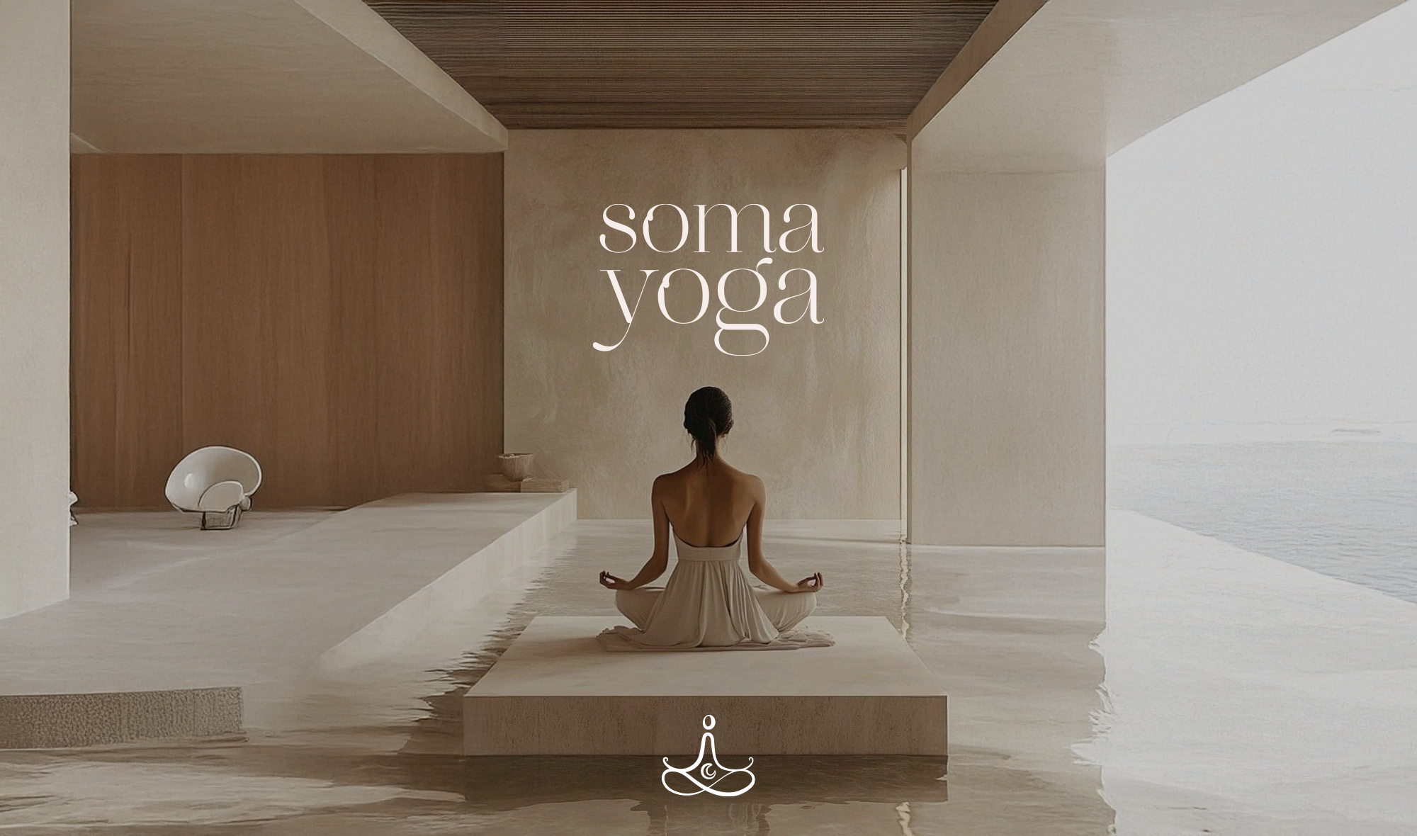
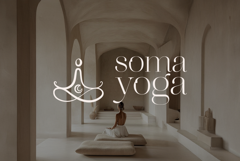
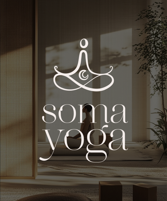
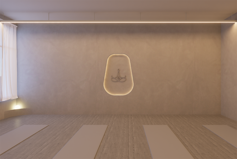
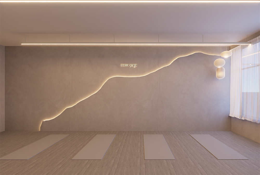
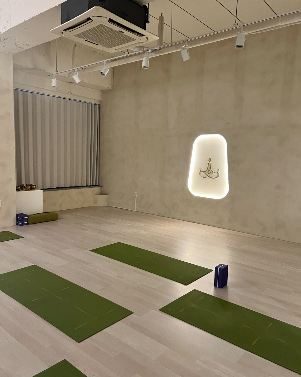
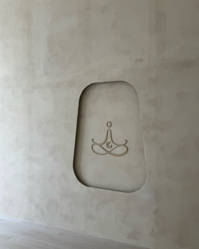
For Soma Yoga’s visual identity, I designed a tranquil logo that captures the essence of Sukhasana, depicting a meditative figure embracing a central moon—a symbol of renewal, cyclical balance, and inner healing. This form reflects the studio’s mission to guide authentic living through restorative yoga and deep meditation. The color palette, grounded in neutral tones and soft sand hues, evokes a sense of natural calm and timeless simplicity. The typography, set in a refined humanist serif, lends the brand a warm, grounded, and contemplative character that aligns with the spiritual roots of yoga.
The visual identity system is intentionally minimal yet expressive, using balanced composition and spacious layouts to create a feeling of ease and clarity. Subtle textures reminiscent of moonlight and organic surfaces further soften the visual tone, while consistent use of the Sukhasana-inspired form ensures immediate recognition. Every element—from the moon-centered symbol to the typography and palette—is crafted to honor the ancient wisdom of yoga while presenting it in a contemporary, approachable way, offering a visual language that feels both restorative and timeless.