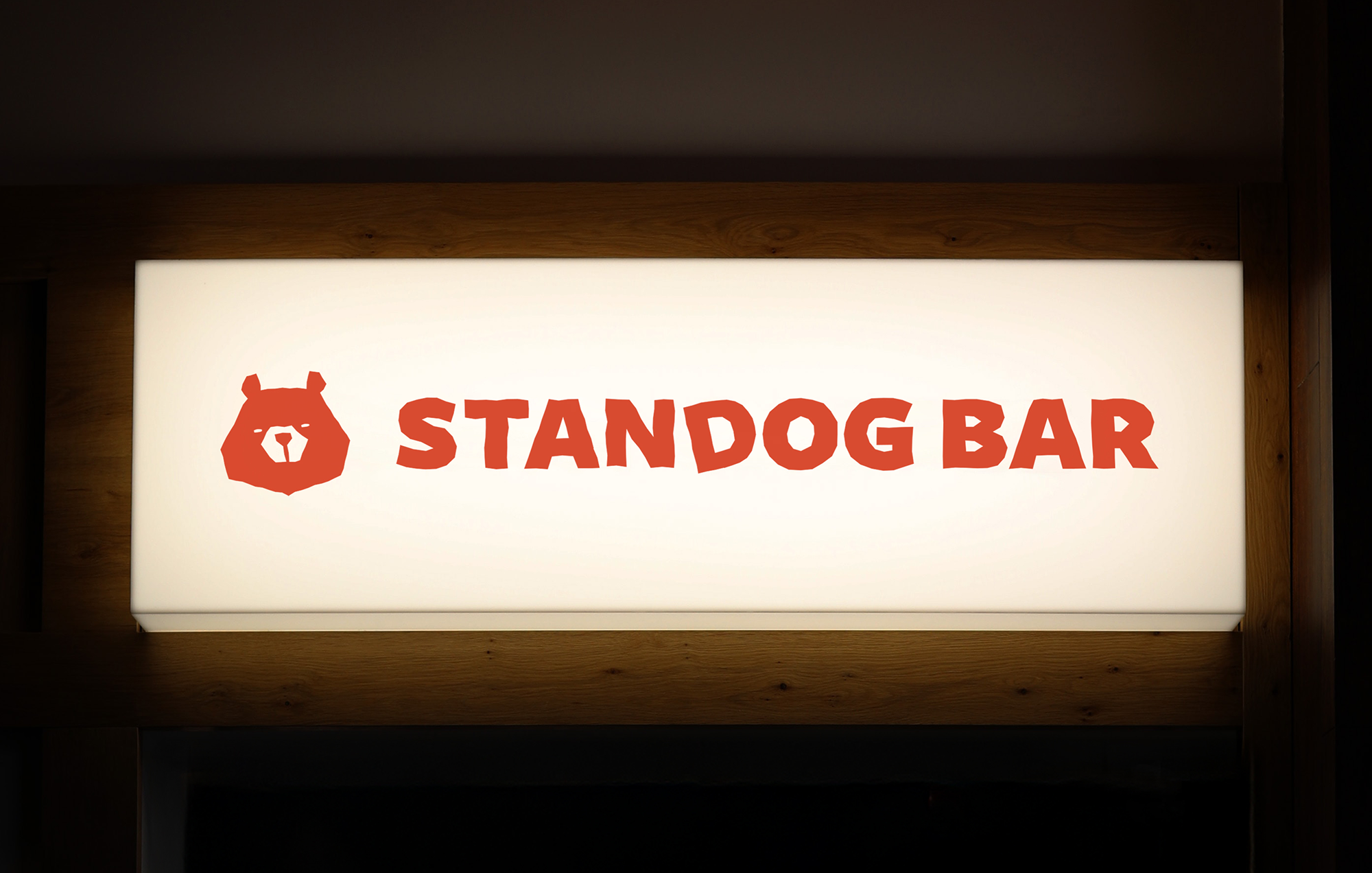
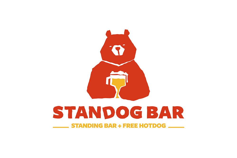
For Standog Bar’s branding, we created an identity that emphasizes its casual and straightforward charm. The logo combines bold, weighty typography with a nonchalant bear character holding a beer, capturing the mood of winding down after work with a relaxed drink. To make the brand name more intuitive, I incorporated beer-inspired elements that immediately hint at the bar’s core experience. The ketchup-and-mustard color palette, inspired by the free hotdogs served with each beer, adds a playful, appetizing accent while preventing the identity from feeling overly serious or polished. This combination of bold shapes and warm, food-related hues strikes a perfect balance between casual comfort and strong visual presence.
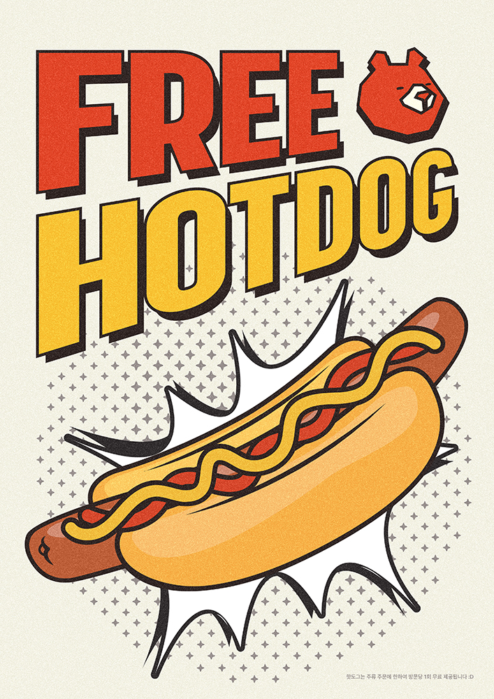
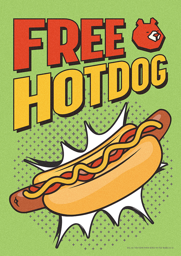
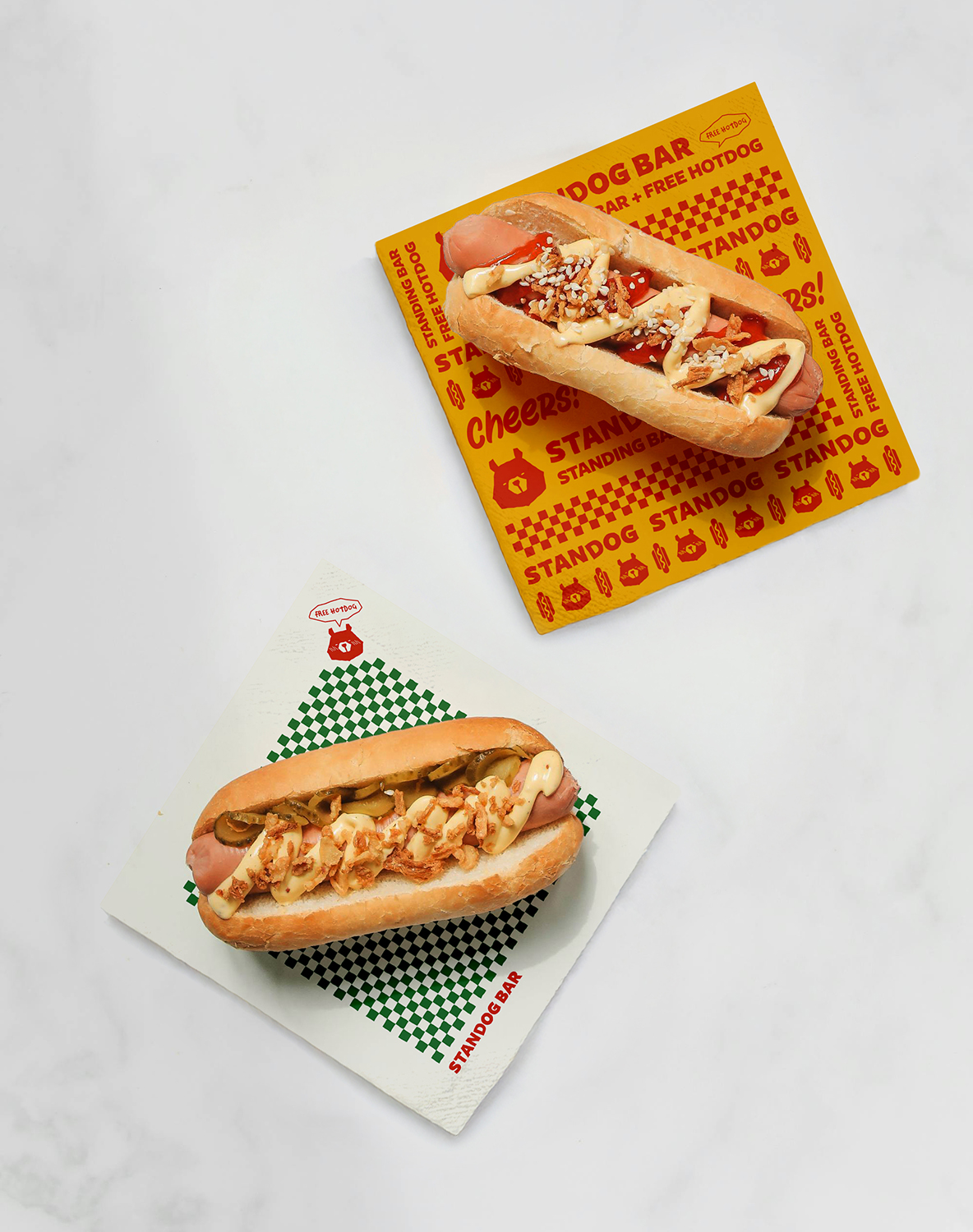
The extended visual system carries this identity into various touchpoints, from retro pop-art–inspired posters featuring beer and hotdog motifs to packaging elements like hotdog wrapping paper. These designs leverage the logo, slogan, and food illustrations to create a cohesive, nostalgic atmosphere while ensuring the bar’s concept is instantly recognizable, even from a distance. The posters and printed materials use clean but striking layouts, leaning on retro textures and vibrant contrasts that match the lively yet unpretentious character of the space. Altogether, the branding establishes Standog Bar as a place where fun visuals, approachable design, and easygoing energy come together to invite customers for a relaxed, memorable drinking experience.